Monday, March 27, 2017

Studio Space: What You Need to Know...

Whether you are an artist, a music artist, a writer, or someone who just enjoys crafts and sewing, one of the MOST important aspects of what you do is what you surround yourself with.

Whether it's blank walls to stop yourself from being distracted, a room to keep your supplies, or a place surrounded by inspiration and reference, this space is, for all intents and purposes, a "sacred space" where you can create and do your work.

This space, my friends, is the Studio.


(The studio of the man with the magic pen himself-- Hyao Miyazaki)
I am obsessed with finding new ways to organize my supplies. Especially since I live in a small, small house, it's important that I keep my art supplies as compact, yet as accessible as possible in order to work the way I need to. Of course, I have dreams and aspirations, and someday I want a room devoted to art. I'm gathering ideas now to guarantee that I know what I want so I don't waste money trying things that don't work for me.

Now, a studio for everyone means something different. Most people I know have some sort of "craft room" or "sewing room" in their home, but it's rarely devoted to just that. For them, it's a corner of their storage rooms where they can store their current projects, or tuck it out of sight to work on once in a blue moon... (Now, I know you do this. No point in denying it)

Regardless, the point of this post is to give you an idea on what a studio space needs in order to be motivated to be IN it, and enjoy the space you are in, as well as find the supplies you need.

1. LIGHTING

Every studio needs good lighting. Dark rooms, unless you are doing traditional photography, are impractical.

Why is it impractical to have bad lighting?

A lot of art is all about precision. If you do needlework, you are making tiny incisions with a needle and thread and need to see where your fingers are going. If sewing, you need to see the big picture, not necessarily just where your sewing machine is going. If you are an artist, you need to see the colors you are using and see where your pen strokes are going without having your art covered by your hand's shadow. If you are doing anything that includes recording, you want to have lighting on your face and your work so that the video quality is good and readable to your audience.

I will go over some kinds of lighting for what you need, and their pros and cons

Natural Lighting
This is perhaps the best and most healthy kind of light. Also, having open spaces with wide windows or skylights brings a cheerful atmosphere to any room and reduces stuffiness. Having windows overlooking gardens or landscapes can bring peace and inspiration. The pattering of rain during stormy days can make a wonderful work conducive environment.


(The studio of Rebecca Rebouche)
While many artists would argue that the natural lighting is the best, it DOES come with its cons.

-Sun damage to art
 Many mediums and dyes, whether it's art supplies or fabrics, will bleach in the sun. Not only that, some furniture and knicknacks will bleach as well.
-Increased heat
The more the sun shines in the window, the hotter a room gets. Even with drawn curtains, the heat will rise. Unless you have a good ventilation or air conditioning system in place, this may make work conditions absolutely awful.
-No light/ low light conditions
At night, you aren't going to have that cheerful sun. Also, grey and gloomy days, though good for photography, may not be the best kind of light for painting.  So unless you have fallback lighting, your workday will end when the light does.

LED Lighting
This has become probably the most common kind of lighting as most countries have started moving to greener energy sources. These lights take up less power than the old school bulbs, and last a ton longer. They also tend to be brighter as well.
Whether it's the lights with the long "bars" or just lamps with LED bulbs, there are plenty of options for lighting up your studio.


(The studio of Adam Lee, who has skylights as well as LED lights)

The cons are that LED lights function by flickering very, very fast. Many people gain headaches from the constant flickering and intense light. People who have issues with seizures or epilepsy, or if people are just sensitive to that kind of thing. After being under LED lights for too long, I start getting headaches as well.

For the long "bar lights" they are often high overhead, and although they don't burn out very quickly, they are difficult to replace.

Swivel Lights
Do you ever wish your lighting was adjustable? Are you recording videos and need light in a couple of places? Then perhaps the Swivel light is best for you.

(Favorite of animators everywhere)

That's right, this isn't just the cute mascot of Pixar animation. This light has a very practical use. (After all, they chose it as their mascot for a reason.)

This is the kind of light that people like Jazza, or Jake Parker uses for their videos. This allows them to move the light to their face when they are talking, or the paper if recording a drawing and to minimize drawing. This also allows you to work in minimal lighting conditions- having darker rooms may help with concentration and minimize headaches. If the light is too bright, you can pull it back a little. It also tends to be quite inexpensive.


The cons are mostly in the upkeep. These lamps do have to be constantly moved, turned on, turned off, having lightbulbs replaced, and the most important thing is that to work effectively the rest of the room will have to be lower light, which may not necessarily be what you need if you are constantly moving about with your work and studio. In order to have a happy medium to have moving light, but have a well lit space has to be...

Studio Lights
(Now we're getting all high falutin up in here) 

These are often used in museums or galleries to have a "spotlight" effect, focusing the light on the pieces to draw the viewer's eye.  This can allow you to have the light where you need it, but without having it as focused or intense as the swivel lights.

The issues are that installing studio lights CAN get expensive. Also, you do have to reach high to move the light where you need it. Also, the higher your ceiling, the less effective this is because the less focus the light will have.

Finally, there is the hipster, shabby chic studio trend...

String Lights

Now don't get me wrong, I LOVE string lights. But this is probably the least effective as far as practical lighting goes. If you want to do this, it will be purely for aesthetic's sake. Notice how the above picture has normal lighting to go with their string lights.  Which leads to the next topic.


2. INSPIRATION

You want your space to make your creative juices flow. This is something different for everyone.

Andrew Huang, music artist and Youtuber in his studio tour said that he wants his space "plain" (By that he means not too much decor or clutter, plain colored walls, furniture that can be moved easily) in order to allow him to not get distracted.

Jazza, youtuber and illustrator said that he painted a big mural with his favorite things behind him to allow him to be in the zone, to remember why he is doing what he is. He is also raising money currently to earn enough to get a bigger and more effective studio space (that doesn't flood):

Jessica Douglas, Fantasy artist said that for her space, she is picky about the art that is put up. She doesn't often get art from other artists unless it really connects with her.

Surround yourself with things you love and that you draw inspiration from, but do not put up things that will distract you from your art. Whether you need color to help you get inspired, or plain floors and ceilings, make it so as best as you can.

For me personally, I need an organized space that allows everything to be found easily. However, I also need more decor and knicknacks- paintings from other artists, beautiful things hanging from the ceiling, music, cozy space, working color schemes--

However, if it gets too cluttered it gives me anxiety. Hyao Miyazaki's studio, shown above, would drive me absolutely INSANE while Rebecca Rebouche's and Adam Lee's studio is far too plain.

I can't say I have found one single studio that is absolutely what I want in my life. I have pinterest "mood boards" for things and ideas that I want which will eventually become something new.

Here are some of my "mood board" pins for my future art studio:


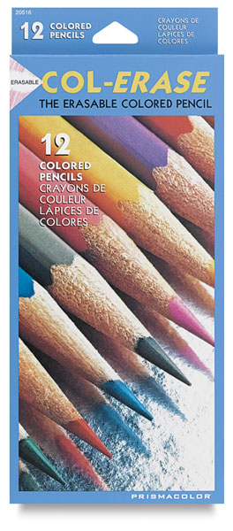
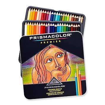
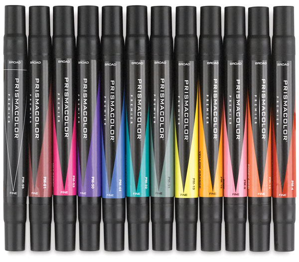
3. STORAGE/ORGANIZATION

This is BY FAR the MOST important part of the studio if you want to function in the slightest. On top of having an inspiring space, you need a PRACTICAL one. A place for everything, ease of cleanup, a place to put finished pieces so they do not get damaged...

Now, to be completely honest, no matter how much organizational stuff you buy, YOU WILL NOT BE ABLE TO COMPLETELY OPTIMIZE YOUR SPACE UNLESS YOU DIY IT.

There's just far too many art supplies out there, and far too many organizational tools that they CLAIM work, but as you go forward you will find that you STILL don't have enough, and that your space is starting to get cluttered by organizational stuff.

Luckily there are THOUSANDS of space-saving DIY ideas on pinterest, whether it's putting magnets on your paint and hanging it upside down on a metal cookie sheet, using jars or buckets, or the ingenious pegboard.

The best thing I could suggest is MAKE DIVIDERS, whether in your box, bucket, drawers, etc. That way you can sort things by color or size. Also LABEL things with what they are.
-Use file tabs in box dividers to state a size or color.
-Use washi tape, office labels, or chalkboard stickers to label each drawer and box.
-make sure that it is legible and visible.

Other things I would suggest is to make sure things are always in reach, so you don't have to waste time digging for the right box or right tool. If it becomes too much of a hassle, re evaluate your organization and move things around as necessary.

4. WORK SPACE

There are spaces for storing and holding supplies and projects, and then there's your space to work. Depending upon workstyle, this could be different for everyone. For me, I need my space to be large enough to draw on and keep my current tools out on, as well as have my computer/ipad nearby. I also want to have an angled surface or a drafter's table so that I can draw things upright. Wile I intend to have an easel, that will not be my primary workspace, though I will need it accessible for streaming and recording videos without too much effort. 

Probably the best example of what I'd like for my workspace is the studios of Jake Parker or Howard Tayler.


Jake Parker has the drafting table with the swivel light as well as recording equipment, the computer with the cintiq nearby to see what he is doing. It's also very easy for him to angle his monitor near his workstation for the sake of using reference.

Unfortunately I could not find photos of Howard Tayler's studio however I have gotten to see it in person because I am friends with his daughter. He has a drafting table with a nightstand by it for supplies, swivel lights, and two monitors on swivel platforms that have the capacity of moving closer or further away depending upon what he needs it for. His studio is much smaller than many of the ones I've seen, but it's very effective. 

Size of your workspace is different for everyone. Some of the studios I have seen are HUGE, others have a corner of the living room and that's all they need. Others eventually graduate to bigger spaces depending upon their need to help them work more effectively.


To sum it all up and wrap it with a neat bow, STUDIOS ARE DIFFERENT FOR EVERYONE depending upon their need. My need is different from other artist's needs. It's a matter of taste but also a matter of using your space effectively and organizing in the most effective way possible so you have access to your tools. Lighting is a big part of the mood of your room, though your work space is THE most significant and should be the center of your space. Size can vary, but it needs to be for your needs. If you outgrow a space, change as you need.


Wednesday, March 8, 2017

Picking the Pencil that is Right For You

Welcome to Ollivander's! What, wand shop? I have no idea what you are talking about. We sell colored pencils here. And we are here to find what kind is right for you.


Now while there won't be dancing lights, magic winds, or something of the sort, it is very important you test each one. Each colored pencil, like wands have a "core" that gives it it's power. Not unicorn hair or dragon heartstring-- no. The cores of the pencil are made out of two things: Pigment, and binder. It's important you understand what is what and what DOES what before you pick out what you need to obtain the desired effect.


There are two categories of colored pencils- Traditional and nontraditional colored pencil.


Traditional pencils are either a wax based or oil based binder with their pigments. There's a myriad of varieties within this- harder wax, softer wax, vegetable oil, other oils.

The results are VASTLY different.

Wax-based pencils are the easiest and most common to find. This includes Crayola, Prang, Roseart, Prismacolor, and all the other BASIC brands. They are really good at being blended and getting a smooth effect, but break easily and can "bloom", or have the wax make weird white marks on the surface especially over time.

These pencils can be blended or "burnished" with either a colorless "wax" blender, white or cream or any other color pressed hard, or alcohol or some sort of oil. (Note, whenever I blend pencil with oil or vaseline, it does NOT like being colored over after that point.)

There is such a MYRIAD of pencils to choose from in this category, from varying hardness and softness. Prismacolor being the leading brand.


Traditional Prismacolor pencils are a soft core, allowing better blending buuuut you get to the point where you simply can't layer anymore. Too much wax will block out the surface. When I reach this point, I often actually use alcohol or an alcohol based marker (Usually copics), blend it down, and then continue working over it again.


(Here is a drawing I did with prismacolor pencils and lined with a copic fineliner. You can see that the colors are VERY vivid)


However, there's the Prismacolor Col-erase pencils which are on the absolute OTHER spectrum.


(The packaging cracks me up-- it looks quite old school despite being the same brand as the fancy packaging above)

These are VERY hard lead, giving you a very very light, soft touch and gives you a more pastel feel. The upside is that they last a LONG time and can be erased with only a LIGHT outline left afterwards, but the downside is that if you want VIVID colors like the Premier pencils, well, it's not going to happen. However, these are choice for illustrators making sketches.

(This one was primarily done with Col-erase pencils, though I DID touch up the darker areas with prismacolor markers. It's also worth it to note that this was done in 2011)

The thing that I like most about Col-Erase is it's easier to get a smooth effect with their lines, as well as getting super detailed in areas like fur, folds, or the detailwork on things like the tattoo, scales, tree bark, etc. But alas, the tones all blend together mostly due to it all being the light tones and there being a very little way to push it darker.

These are the two extremes of course-- I know that Prismacolor has verithin which is a good in between of these two extremes, but I haven't had the chance to use them myself.

A good chart to see the pros and cons of each kind is this one: http://thevirtualinstructor.com/blog/colored-pencil-comparison-chart

This site is an extremely good resource in all kinds of traditional medium too, and very worth reading.

ANYWAYS- so that's the variety, pros, and cons of wax pencils. The Oil based pencils are something ENTIRELY different.


Oil based pencils are a LOT harder to find and tend to be more expensive than your waxed based pencils. However, their quality I would say is overall better. The color is very smooth, the core harder and sturdier than most wax based pencils and less prone to breaking; keeping its point longer. However, despite the harder lead, the color is still VERY vivid- which means that less is indeed more when it comes to these pencils.

They have a harder time blending with itself, however can be blended with olive oil, vegetable oil, walnut oil, or mineral spirits like you would oil paints. This may make it difficult to draw over with anything else however.
They also are capable of working alongside wax based pencils despite being inherently different.

The most noted and common of these is the Polychromos pencils by Faber Castell. I recently have acquired a set, but my experimentation on them has been minimal. However, I had the opportunity to compare them side by side with Prismacolor pencil and there was really no mistaking just how much better these pencils are. Just with one stroke, the color was more smooth and stuck into the tooth of the paper much better. The color I'd say was just as vivid as prismacolor.

So far, I prefer these because of their durability and the smoothness of color.


NON TRADITIONAL COLORED PENCILS- This is basically EVERYTHING ELSE that isn't wax or oil based cores. This includes Watercolor, graphite, inktense, pastel pencils, clay-based pencils... Or anything else, really. There is such a myriad of products being made that it's impossible to say them all. So I will focus on two of my favorites, and two that I have actually used.


Watercolor pencils have a water soluble core, usually having the same kind of binder that you would find in pan watercolor paints. 

(Yep these sweet babies. What? I'm not picking favorites or nothing)

They are blendable with water (Or... With spit as my 15 year old self discovered) yet are drawn on like a pencil. The color can be mixed with wax based pencils without a problem and it's not too much of a difference between the two strokes. However, when painting with water over them, they ARE harder to control the blend, and there is some pencil stroke left behind. So I'd much prefer using watercolor first, than perhaps using watercolor pencils for detailwork. They are often cheaper than high quality wax pencils, and MUCH cheaper than oil based pencils.

And then.. There is Inktense pencils.

(The GOD of all water soluble pencils. And the price shows it)


Inktense pencils have rich, vibrant colors and has an ink core. What's interesting is that when dried, it becomes essentially permanent and is able to be worked on top of. However, if you're wanting PASTEL tones, go somewhere else because these only come with bright and brighter colors. I enjoy using these on top of my watercolor paintings to add more detail, brighter colors, or just redo particular areas. This means you can overlay light on dark without muddying the colors.

It draws as smoothly on a textured, painted surface as it would on plain paper. The color also overpowers and shines through midtone paper. It also plays well with others. I haven't had issues with it clashing against wax based cores or watercolor cores, though I need to experiment how it works with oil based cores.


This piece, the Frog Prince was done on midtone cardstock. However, it's impossible to tell from those exquisite yellows and greens. I added white ink on the top since I didn't have a white inktense pencil, however there was no need to add anything else I felt. The color spoke for itself and anything beyond that would take away from the vivid, flowy colors. I also enjoyed dipping the lead in water straight, as that gave areas of DEEP color. I feel that no other water soluble pencil compares to this one. 

For more information on watercolor or non traditional pencils, look here: 
http://thevirtualinstructor.com/blog/colored-pencils-vs-watercolor-pencils-vs-the-others

Overall-- Who am I to say what pencils are best? There are so many kinds. So many to try.


(Like, really. Yikes.)

What I would suggest is read reviews. Start with small sets or small single pencils. Do your research, use the crap out of them. Try mixing and matching, blending with other pencils and other materials. What does it do when you pour alcohol on it? What about if you blend it with oils? Water? What happens when you put it on a toothy paper or a smooth paper?

Personally I LOVE smooth pencils and vivid colors. The smoother the better. Part of that is the tooth of the paper or blending and burnishing it with different materials, but if I can get a pencil that gives me the richest and the smoothest effect while playing along with other mediums, that's the pencil for me.

And who knows? You might find the perfect thing. Find a pencil that really lights up your world. 


(Other resources: Jazza's video upload from today. Very useful and interesting to see the difference: https://www.youtube.com/watch?v=Kx1SoWJT6nw

Also, though I've already mentioned it, this is an amazing resource: 
http://thevirtualinstructor.com/colored-pencil-drawing-tutorials.html

Always, Deviantart has some really neat tutorials as well. Here's a few of my favorites: 
http://nithak.deviantart.com/art/Colored-pencil-tutorial-111852869
http://orig03.deviantart.net/c9e8/f/2006/239/4/2/penciltut.jpg


Tuesday, March 7, 2017

The Prismacolor Problem

So recently I have attended a handful of different conventions and workshops, and have been working with a few local art retailers. Those local art retailers have ALL complained about Prismacolor. Which is FASCINATING to me because seeing things from the other end, EVERYBODY uses Prismacolor or is saving up for prismacolor pencils. But is prismacolor's quality really all that? Or is that what they WANT you to think?

Image result for Prismacolor pencils

As a disclaimer, Prismacolor is still my go-to colored pencil of choice. I use it for most of my colored pencil work. However, I believe that these issues are important and should be discussed at length, at least to make other artists aware of the pros and cons to the supplies that they get. 

Now- a brief history with me and Prismacolor. I started using Prismacolor in high school, actually starting with the Prismacolor markers. I learned about them because of THE INTERNETZ-- as I do most of my supplies originally-- and I really really wanted to try either them or copics. Copics turned out to be out of the price range of a kid in high school without a job, so I started a gradual collection of these babies.

Image result for prismacolor markers

Aw yeah. Back then, they ranged from $2.90 each to $3.50 each. They since have gotten a little more pricy, one of the reasons being is they started chasing after Copics coattails as Copics rose to popularity by getting a brush tip instead of their fine tip. I don't know if they still sell fine tip markers, but all I've seen in art stores are their brush tip.

Anyways, they were pretty decent. I made some decent art with them. Wore them dry, and have still been carrying their empty dried out carcasses in case someday I get refills for them. (Which, I haven't. Haha) The pros to these was their bright, vivid colors that I actually consider brighter than copics. They also are good at mimicking the bright "comic" and "cel-shading" style. When it comes to blending... Well, these pale in comparison to copics. Once I started working and bought my first copics, there was no going back.

No matter what Prismacolor does, they won't be THAT good.
Image result for Copic markers
(Haha sucka)
Now this might be comparing apples to oranges a little. Copics are entirely different with an entirely different feel. I consider copics to be a little more "watery" and meant for blending, giving a very watercolor feel to them. Because of this, it's a bit harder to get the vivid color in many cases. I personally LOVE the gentle feeling colors, but that's not always what you want. Still, many artists would agree that copics are a thousand times better.

Also, I find it interesting once again that once Copics rose in popularity Prismacolor changed to brush tip, and jacked up the prices in the stores somewhat.

Actually, that's part of the whole issue.

In 1938, they were founded, then ran with a few different crowds including Eagle Pencils before being bought out by Berol. Berol then joined forces with Newell and became a HUGE art making industry. That was about 1995.

Now I might be a little salty, but I know that once huge companies become... Well, bigger, things start becoming more about the money, and less about the quality of the supplies. It's a gradual thing. It starts with mass advertising. Getting artists -EVERYWHERE- using their supplies. more than that, convincing them that they can't LIVE without their supplies. They then FLOOD THE MARKETS. You can find their supplies everywhere. You see it everywhere. The art stores have SURPLUSES of this supplies. And then, once the artists are hooked, they suddenly have MAJOR sales. You know, make those artists run to it like moths to a flame whenever those numbers go down.

But in order to support these extreme sales, something has to give. And what gives is quality. Gradually, of course. Perhaps it's cheaper wood. or ways to make their binder cheaper. Or finding a way to factory create the pigments that they once got from the actual dyes. This, of course, is gradual. And they don't ALWAYS put it on sales price. Usually, they make it just the same price. And no one would be the wiser. As it is, the artists continually go back to it because they know they can make quality art with it. The brand is familiar, like an old pair of socks, and they know it works.

Well, those poor local art suppliers are starting to become privy to it. One of the reasons is that because Prismacolor has flooded the market, they can't compete even when getting their stuff directly from Prisma themselves. There are people selling these pencils for WAY WAY under market value and the local retailers would be LOSING money if they tried to compete. More than that, when the pencils are broken, damaged, or just don't work, it's the local retailers that get blamed. And especially in the past three years, complaints have started to rack up.

The biggest things are the fragility of the pencils. And in fact, this is an issue that I have been having with my set of prismacolors and one that leaves me quite frustrated. For one, the lead often slips out of their wooden pencil casing, slipping and sliding and making the pencil virtually unusable. I have found a way around this with the help of my friend and local illustrator Keliana Tayler, which is to tape the bottoms of the pencils. It seems to be a decent fix.

However, the second is not such an easy fix. That is that whenever you sharpen the pencil, the lead seems to ALWAYS break, and it takes three or four tries before you get a nice sharp tip to continue drawing with.

Now, I'm also really rough on my art supplies, as I am rough on my clothes and shoes too. I carry them in pencil cases in my bags where they are jostled. They fall on the ground. They get stepped on sometimes. I'm not the kind who babies my art supplies. I'm not going to carry my pencils in a velvet pillowed case. This is perhaps to my disadvantage because eventually the wear and tear of just simple transport and just time wears on the durability of the pencils and can break the lead inside the pencil. So, one of the things I COULD suggest is to find a nice, sturdy pencil carrier to carry the pencils in, and to only take them when you need them to avoid wear and tear.

Image result for prismacolor pencil case
(This is one that I have seen artist Keliana Tayler use, and it's good for when you are the go, protecting your pencils, and sorting the colors so you know EXACTLY where it is)

HOWEVER, I also submit the argument that you make do with what you have. I have used the metal casing that the pencils normally come into, but the box often jostles open and the pencils end up in the bottom of my bag. I've used plastic ziplock baggies but it eventually gets full of holes and isn't very pretty. I've ALWAYS carried one of those zip up pencil cases but they always tear around the zipper area before too long. And those plastic pencil cases you get in elementary school are good, but I find them often too bulky to carry around in my backpack or Handbag of Holding.

Regardless, make do with what you have until you can afford THE NICE THINGS. (Also why doesn't Prismacolor just sell them in this nice case in the first place? It would make everything a lot easier)

There is also the issue of sharpening pencils. I have heard one colored pencilist say that sharpening pencils is like breaking the necks of the poor pencils which was a VERY MORBID way of looking at it. Instead, he argues that you should use sandpaper to sharpen your pencils and that it will prolong their life and not twist and crack the lead.

For the determined artist, that might be a good fix. However, I personally don't have time for that and instead I've used different pencil sharpeners.

While it's true that the cheaper the pencil sharpener, the more likely it is to break, it seems whatever  hand sharpener I used didn't make too much of a difference. I bought PRISMACOLOR'S OWN colored pencil sharpener, which has two holes- one bigger and one smaller. I've tried using both and it still breaks equally as much-- though I had a little more success with the bigger hole.

Image result for prismacolor pencil sharpener


I have also used metal sharpeners and it still breaks rather quickly. Same with cheapo plastic sharpeners. The wall mounted sharpeners eat the pencils alive.

Image result for wall mounted old fashioned sharpener
You know EXACTLY what I'm talking about.

The only thing I really haven't tried are electric sharpeners, and that's because to get one that is worth its salt is rather on the pricy side, and I don't trust 20 dollar cheapo electric sharpeners. They don't sharpen anything and break right away.

Really, I haven't found any solutions to the pencil breakage problem. Except maybe using sandpaper, and I'm not going to do that.

Also, I'm not about to BOYCOTT Prismacolor either. I'm not going to throw my carefully acquired pencils into the fire and dance around it because they are still of decent quality and by golly I am going to USE what I've bought. However, I intend to transition to different, better quality pencils as I go on, and phase out my prismacolor pencils.

As it is, I'm using Koh-I-Noor colored pencils and Faber Castell colored pencils more often, mostly due to ease of transport, though I do grab specific color palletes that I may need for a specific project, bundle it up with a rubber band, and take it with me if that's what I need for the day.

I can't say what's the BEST quality pencils either. I will be posting a post later about different pencil brands and what they look like on paper. I am going to continue to experiment with ALL OF THEM and see what I personally prefer, because in the end it's a matter of preference. And to be honest, I care more about creating art than I do the corruption of large companies and their sneaky ways.

However, I suggest that if anyone wants to buy quality pencils, DO YOUR RESEARCH. See what different artists prefer, and gauge from there.

Here's a good resource that I used for reference:
https://wiki.ezvid.com/best-colored-pencil-sets?id=adw&gclid=CjwKEAiA0fnFBRC6g8rgmICvrw0SJADx1_zAUC7SzXaJmcPegz2ECOFld7A79-g8Lqh8c423-aLIdxoCJM7w_wcB

And if anyone wants references on where I got this information, I've gotten it from the retailers at Artist Corner in Provo and Color Country Art Supply in Cedar City as well as talking to a myriad of artists about it. If there are any questions, feel free to ask.

Tuesday, January 24, 2017

A woman of a Thousand Dreams and few Realities

I decided to have a change of pace this semester. Since I've metaphorically "hit a wall" until I recieve my teaching certificate with my art education side of things, I decided to do something a little more tactile that will still further my art abilities. I turned to the theatre department and signed up for the makeup course, and got permission to audit the costume design course.

This has come with an interesting set of discoveries, as well as challenges. First off... Makeup is EXPENSIVE. And it seems that makeup, like art supplies, is one of those things You can't have enough of.

However, this has inspired and reawakened a part of me that has been dormant for a LONG time- The love of makeup and fashion.

Furthering that, the costume design class, despite being a time consumer, has taught me very practical applications to character design that I WISH I knew a semester before because it would have made my life a lot easier.

Learning these NEW things, especially for things I THOUGHT I knew, has kind of brought me back to the basics. I realized that I know very little.

I think one of the other things is that the classes I am taking now, though heavy in workload, are drawing us back to basics as well. For instance- learning from the ground up the fundamentals of digital art. Learning gesture and doing nothing but gestural poses so far in my Narrative Illustration class. Going to the open figure drawing studio on Tuesday nights and realizing that even my figure drawing was rusty.

Aside from classwork, I have found myself surprisingly tired and unmotivated.

What makes me sad is I have so many desires, so many passions, so many dreams and things I WANT to do, but I feel like currently I don't have the capacity to do it. I have the capacity only for school and even there, I feel like I'm starting over in a matter of speaking.
It makes me extremely sad because I constantly watch videos from youtubers who are making their living through their videos and working hard on that, read facebook posts of successful artists making a living at what they love, and here I am realizing that I  haven't done anything since school began to further MY dreams and MY career. I am then filled with a sense of shame for being "lazy".

Why, having lots of schoolwork has never stopped me before. Why should it stop me now?

I'm not entirely sure why, but I think my clinical depression is at play in part. But I hope to get over this hurdle soon.

Thursday, January 12, 2017

The Death of a Legend

2017 has started with major celebrity deaths, like Carrie Fischer. But a few days ago, there was a death that rocked my family's world as well as the world of fantasy artists everywhere.

James Christensen

James Christensen has  helped shape the world of fantasy art as we know it now. Before he rose in fame and acclaim, fantasy art was a small, niche thing. Which is strange, considering old masters would call upon myths to make their paintings.
"Fantasy art" at this point was considered "Illustration". There wasn't a correlation between it and fine art as far as many critics believed. More than that, the 80s was largely a tough time for fantasy anything especially in a relgious context, as many Christian denominations were claiming fantasy books, Dungeons and dragons, and other things were "of the devil."

James Christensen broached all of these things, and shattered these misunderstandings. He supported the fantasy and science fiction community, became one of the most famous painters not only in Utah, but the world, was very strongly religious and even taught at the religious university- Brigham Young University. He crossed the line of "Fantasy art" and "Fine art" and paved the way for many illustrators following.

He inspired many, helping them to follow their dreams and perfect their art. He helped teach one of my professors- Illustrator Hala Swearingen as well as being friends with many many other professors in my college's art department.

Most importantly to me, he has inspired my family. He is my mother's favorite artist and has been since she was in college, I grew up with his art on the walls of my home, with his books on our shelves. I recall visiting an exhibit of his claymation figures and being amazed by it. His words also has helped me through times where I was doubting myself heavily.

It all started when my mother read an article he had in the 1989 August New Era where he was interviewed by a writer in the LDS church about his art as well as how it ties into his spirituality. This was the first and-- as far as I know-- Only time that there's been an article about fantasy in any church magazine. More than that, as stated before, this was a tough time for fantasy as it was being contested and many religions was calling it evil. It brought my mother hope, and she looked up the artist and has loved James Christensen ever since.

In case you are wondering what I'm talking about, I have a very special treat of antiquity here- I have the original magazine pages of that New Era article, which I haven't seen anywhere else.


There was a woman on my mission who had years upon years of old church magazines. I told her that if she ever found the August 1989 new Era, I would love to have it for this article, which I had read previously on LDS.org. However, LDS.org did not have any of the art and I LONGED to have and see some fantasy art desperately and have a physical copy of what I found to be comforting words of a fellow artist.

She found it, and gave it to me as a gift. And now, in homage to James Christensen, I give it to you.

A lot of what he says in this article, I still use when describing creativity and my art alongside my religion today.

Monday, January 2, 2017

Product Review: Winsor and Newton Pigment markers

While I was at CTN: Expo, Windsor and Newton were there allowing artists to test their lines of markers. Each had a different purpose- one was the watercolor marker, which was water soluble, one was their alcohol based marker which they claimed worked like copic markers, and then pigment markers which was something else entirely.

Basically it's a marker trying to transcend it's markerhood into something close to paint. Its tips are made to act like paintbrushes, and the colors made to be blended. Whatever binders they used is "top secret" because they are trying to still patent it- it's that new. At least that's what the lady at the booth at CTN was saying.

Now, I was excited to see something entirely new on the market. When it comes to markers, especially those used for fine art or illustration, it usually comes down to two categories: Copic markers and then markers trying their darndest to be copic markers. (No really. Prismacolor changed their ENTIRE MARKER DESIGN to include a brush tip instead of a fine tip so that they could be a little more like Copic. And if they say that isn't the case, they are lying because they didn't change it until Copic was wiping the floor when it came to the market)

So seeing a company throw everything over their heads, say "SCREW IT, WE'RE DOING SOMETHING DIFFERENT" and going all out on making something new is very admirable. Whether they did it WELL... Well, that's something to be debated.

Image result for Winsor and newton pigment markers
The first thing they mention on the website is not the color capacity of these, but their outside. They explain that it's a very sleek easy to grip and easy to control marker with a chisel tip and fine tip.

Honestly, focusing on the outside first is like saying "Look at this gift! Isn't the wrapping paper nice? So well wrapped!" I mean, I get it. The different outside marks that this is a "different marker" but as an artist I'd rather hear about the color first.

The second thing they mention is the archival quality of the marker. The pigment is made to last under intense light- (Also known as Lightfast) and should last well at least 100 years. (Which, this marker hasn't been around for 100 years let alone a drawing done by these markers so that's to be debated how well they hold up)

They work best on coated paper- paper that has a smooth, slippery surface that works best with markers. Winsor and Newton has come up with their own paper pad that fits the bill, but paper for pens/ink or marker paper works. Vellum bristol is likely to work well too.

UNFORTUNATELY, the Winsor and Newton Pigment pen paper WRINKLES. BAD. It's very thin paper, but with the smooth coated surface. I would actually not suggest using this paper besides testing the capabilities of the marker.
(Seriously. You know it's bad when the REVIEW VIDEO has the paper wrinkling.)|


Here is my test drawing on the Winsor and Newton pigment marker paper. The color is not absorbed at all, keeping it rich and fine. The coated surface allows it to blend evenly. However, it DOES wrinkle, and eventually eats at the paper giving it a bumpy, fibrous surface. More than that, you can see that the colors do start coming through on the other side. Overall it wasn't my favorite. I went ahead and bought a much thicker and durable pad of Staedtler marker paper.


Anyways, that's Pigment Markers at a glance. Let's talk the nitty gritty and application.

First off- These markers are WET WET WET. It's not uncommon to have pigment leaking out the sides messily, especially if the tip is loose. The fact that it has a loose tip is interesting because it doesn't exactly have a refill.

The chisel tips sides were often frayed. This is because of it constantly rubbing and scraping against the tightly-fit lid. It didn't affect how the marker worked at all, it just wasn't very appealing.

However, on thicker marker paper, it seemed to retain the color without damaging the paper at all. It kept the vibrancy and the wetness/blendability of the marker. I also tested it on copy paper, and sure enough, it ate and bled through it like anything.

(Of course, my test drawing is an anime eye. Those are far too fun to draw)
The next big test was what inking pens held up with it. This is an important test when using ANY marker or paint to ensure the colors don't get muddy or the lineart isn't destroyed. Unfortunately, I have to say that very few inking pens lasted under the test. The most unfortunate was my Pilot VBall bg 05 which has become my favorite inking and drafting pen.

SURPRISINGLY, the pens that worked the best was Sharpie and Le Pen. Le Pen I've had a hard time working with my alcohol based markers, but it works surprisingly well with this pen. The muddiness you see is actually because I didn't clean the pen before moving on to the next color. The Sharpie held up the BEST of them all- while Faber Castel held up the worst.


For my next test, I tried to blend it with and over other brands of marker, specifically alcohol based to see what the effects would be. It worked surprisingly well with Prismacolor when it came to layering colors, but overpowered the softness of the Copic. Copic caused some smearing and blending when layered on top of it.

When layered with itself, I noticed the tendency for the dark colors to overpower the light instead of ending up in a smooth gradient. The best suggestion I can give is to actually work dark to light when it comes to blending and layering these markers.

As far as the stroke of these markers go, it's nigh impossible to hide the direction of the stroke due to the kind of ink it is. It reminds me of painting with oils, and how each stroke left an impression. Perhaps it'd be easier to hide a stroke with the tiny fine tip, but I was unwilling to cover large areas with it to see. Perhaps the directional issue could be solved if there was a brush tip instead, but I'd like to think that there is a beauty in seeing the directional strokes- you just need to be mindful of where your strokes go.

(As I said- there's no hiding the fact that this is done in marker and the direction of each stroke. However, this particular piece looks like watercolor and is certainly beautiful in its own right.)

Now, in order to test the capacity of the markers, I decided to try a full illustration.


At this stage, I tried to keep it entirely Pigment markers aside from the inked lines. Only the base skin color for the girl was done with copic markers since I didn't have a skin pigment suitable for what I was wanting.

My previous notes on having to blend light-with-dark and dark overpowering light undercolors still apply to this. I started with a base of yellow for the ground and sky to match with the golden design of the deer, and the cream of the little girl. The yellow was far too overpowering, so I added pint to simulate migh lighter violet tones. Pink and yellow do not read wilderness, however, and so I went on to add greens- including the dark green grass on the edges of the paper. The center turned into water as almost an afterhtought.

While working, It's clear what stroke or blending technique I was using. In some places I used my fingers, and you can definitely tell what was finger blended and what wasn't. Also, it gets to a point where it gets hard to layer any more color. After picking it up again after a day I realized I just had to let the colors dry and set for longer, as it was able to layer a lot better after horus of being left alone.

After I was done with the pigment markers, I looked and asked myself "Is this a finished piece?" And to me, no it isn't. I wasn't able to reach a  completely finished look with the markers I had. Maybe if I had more colors I could have done more with pushing the dark and the light of the drawing, but as it was I really couldn't.

My next step was to layer it with prismacolor pencils. Prismacolors DID NOT react well with either the paper's coating or the markers, or both. While I often layer colored pencils with watercolor or the alcohol based markers, it didn't like this. I will have to further test if it will respond better on different paper. But that caused me to hit another roadblock as my normal layering technique was stopped.

I then tried to layer it with a variety of different markers and pens. Most inking pens jammed when in contact with the marker, and refused to work. Even my VBall was having some issues layering on top and it usually runs as smooth as anything anywhere else. It then turned into "what marker/ink will work with this?"

Acrylic ink seems to work the best, though prismacolor markers was able to work over it quite well after it had taken some time to dry. Acrylic ink was used to push the gold, and white ink was used for the outlines and highlights. I also tried things with pouring various materials on the background, including Copic Various inks in purple, rubbing alcohol, Ken Oliver liquid metals, and gold ink. Rubbing Alchohol didn't make as much of a difference as I thought it would- it mostly washed away the top layer of the Pigment in the places applied. It didn't affect the more dried and set areas. The various inks also didn't do much. The Liquid Gold didn't blend with it, instead layered on the top of it, covering anything underneath. Gold acrylic ink was both able to blend and layer on top, which made it the most favorable out of all of the mixed mediums that I used.

When I realized that the Acrylic ink layered well, I decided to try using my Derwent Inktense pencils to layer on top, which worked wonderfully. (I will write a more in depth review of hte Derwent Inktense pencils later, but for now those of you who don't know what that is they are colored pencils made of ink that acts kind of like watercolor pencils.)

The end result was this:


An overall beautiful piece, but one that relies on mixed media to make up for the markers shortcomings due to the lack of experience, the kind of paper used, and the lack of range of color of the pigment markers. However, the color and use of the pigment marker is still very prevalent in the especially in the textures of the background.

OVERALL, the pigment markers were definitely different. They will not be my go-to medium for mixed media, but I can see great potential. There's pros to them, but also cons.

PROS:
-Vivid pigment
-Archival quality
-Blendability
-Unique stroke
-Layering ability after drying with itself.
-Works amazing with coated papers
-Less expensive than copic

CONS:
-Cannot hide directional strokes.
-Doesn't play nice with many other medium
-Melts or smears most inking pens.
-Having to wait for it to dry before layering
-No refill inks that I know of.

I want to try a few more experiments with these in future mixed medium work, like using them with textured papers or with texture paste, adding them on top of a colored pencil or watercolor piece, or adding it on top of a copic "underpainting." Who knows what possibilities there are?